
Why Images Used in Reporting About Heatwaves Matter

Heat is itself invisible, though its effects are not. And the record-breaking heat waves currently sweeping earth point to the beginning of an ongoing climate crisis that will have repercussions for generations to come. Now, most Americans have been trained to love the idea of summer, especially those in the colder states, so a lot of messaging around rising temperatures comes with vacation imagery and beaches. But that’s not what a heatwave looks like.
For some Americans, the heat is quite literally killing them. More Americans die due to the heat more than any other natural disaster every year. Not only that, it is tanking the economy as it has disastrous implications for workers, companies, employers, and local governments. Not only that, but Axios estimates that disastrous consequences for our infrastructure, country-wide, are just around the corner. That’s nothing that an umbrella and any sunscreen can protect against.
And this heat is only the beginning–a Washington Post study estimated that Miami-Dade county would see about 91 days per year of a heat index over 100 degrees Fahrenheit:
“Unlike the West and the Midwest, which have been scorched this year by extreme heat waves, South Florida has chronic exposure to high heat for months, [Jane Gilbert, Miami-Dade’s chief heat officer] said. This drives up energy costs and endangers outdoor workers, homeless people and those who can’t afford to air-condition their homes all day. The county has designated May 1 through Oct. 31 as an official heat season and launched an awareness campaign targeting neighborhoods with the highest rates of heat-related hospitalization.”
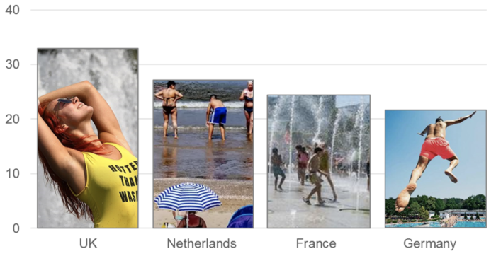
Representing this accurately at the outset with the featured image on the article is important, because the immediate message of the article is communicated visually, not through the text of the article itself. And a study by Dr. Saffron O’Neill, a geography professor at the University of Exeter, found that most stories about the heatwaves did, in fact, warn of the extreme dangers—but that the articles themselves layered positive images on top of an urgent, negative story.
The study also found that no real people were usually discernable in these stories. Several stories seemed to suggest the presence of a person or of people, but images used within these articles were often stock photos or clip art.
“When images did depict the danger of heat extremes, people were largely absent,” the researchers wrote. “We conclude that this visual framing of heat waves is problematic: first, by displacing concerns of vulnerability, it marginalizes the experiences of those vulnerable to heat waves; and second, it excludes opportunities for imagining a more resilient future.”
“Too often, the visual communication of climate change is neglected. As academics and journalists, we can obsess over getting the phrasing of an article spot-on, but then attach, almost carelessly, an image to the document or article,” said O’Neill. But “images are a key part of the communications process — shaping how we think, feel and act on climate change.”